
Most creators spend hours perfecting their video content, then slap together a thumbnail in five minutes. That gap is costing you real clicks. Consistent thumbnail design can boost your CTR by 15 to 38%, yet the majority of channels treat each thumbnail as a one-off creative decision. This guide breaks down exactly what consistency means in practice, shows you the data behind the CTR gains, and gives you a repeatable framework you can apply starting today.
Table of Contents
- What consistency means in thumbnail design
- How consistency impacts CTR and engagement
- Practical frameworks: Applying consistency in your thumbnails
- Pitfalls and edge cases: Where consistency can go wrong
- Beyond clicks: The big picture for retention and the YouTube algorithm
- Try proven thumbnail tools for consistent branding
- Frequently asked questions
Key Takeaways
| Point | Details |
|---|---|
| Consistency boosts CTR | Creators who use consistent thumbnails can expect click-through rates to rise by 15-38%. |
| Recognizable design drives results | Call-out patterns in colors, fonts, and logo help viewers instantly identify your content, increasing views. |
| Over-branding reduces engagement | Too much branding makes thumbnails appear promotional, so balance is critical for attracting clicks. |
| Mobile-first design is essential | With 70% of views coming from mobile, clear and consistent design ensures thumbnails stand out everywhere. |
| Algorithm values retention | Pair consistent thumbnails with honest content to satisfy YouTube’s algorithm and grow your channel. |
What consistency means in thumbnail design
Consistency in thumbnail design is not about making every thumbnail look identical. It means your audience can glance at a thumbnail in their feed and immediately recognize it as yours before they even read the title. That recognition is built through repeating specific visual elements across every video you publish.
The core elements that create consistency are:
- Color palette: Stick to 2 to 3 brand colors that appear in every thumbnail
- Typography: Use 2 to 3 colors and 1 to 2 fonts across all designs for recognizable branding
- Logo placement: Fix your logo or watermark in the same corner every time
- Layout style: Keep your composition structure predictable, such as face on the left, text on the right
- Facial expression or character style: If you appear in thumbnails, use a consistent emotional register
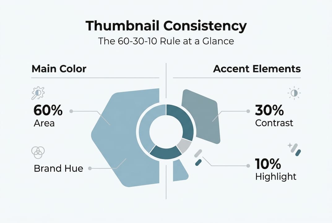
A useful framework here is the 60-30-10 rule borrowed from interior design. Sixty percent of your thumbnail uses your dominant brand color, 30 percent uses a secondary color, and 10 percent uses an accent color for contrast. This keeps designs visually balanced without looking flat.
When you start creating thumbnails with AI, locking in these parameters before you generate anything saves enormous time. Consistency is a system, not a style choice.
How consistency impacts CTR and engagement
Here is where the numbers get interesting. Familiarity drives clicks. When a viewer has watched your content before, a recognizable thumbnail acts as a trust signal. They do not need to evaluate the thumbnail from scratch. They already know what your content delivers.
"Channels with consistent thumbnail branding see CTR boosts of 15 to 38% compared to channels with inconsistent visual styles."
The table below shows how consistent versus inconsistent thumbnail strategies compare across key performance metrics:
| Metric | Consistent thumbnails | Inconsistent thumbnails |
|---|---|---|
| Average CTR | 6 to 10% | 2 to 4% |
| Returning viewer clicks | High | Low |
| Brand recognition speed | Fast (under 1 second) | Slow or absent |
| Channel growth rate | Accelerated | Stagnant |
| Subscriber conversion | Higher | Lower |
The data from an analysis of 10,000 YouTube thumbnails found that custom consistent thumbnails appear in roughly 90% of top-performing videos. That is not a coincidence. Top creators have figured out that the thumbnail is the first conversion point in the entire viewer journey.
Randomness, by contrast, creates cognitive friction. When your thumbnails look different every week, returning viewers cannot spot your content quickly in a crowded feed. New viewers have no visual shorthand to associate with your channel. Every thumbnail has to do the full persuasion job from zero, which is a much harder task.
For practical YouTube thumbnail tips that connect design choices to measurable CTR outcomes, understanding this familiarity effect is the foundation everything else builds on.
Practical frameworks: Applying consistency in your thumbnails
Knowing consistency matters is one thing. Building a system that delivers it reliably is another. Here is a step-by-step framework to get there:
- Define your visual identity first. Choose your 2 to 3 brand colors, your 1 to 2 fonts, and your logo placement before you design a single thumbnail.
- Build a master template. Create a base layout in your design tool of choice that locks in your brand elements. This template should cover 70 to 80% of your content types.
- Create content-specific variants. For series, special events, or collaborations, build sub-templates that share your core brand elements but allow for variation.
- Run A/B tests in YouTube Studio. A/B testing thumbnails can push CTRs to 5 to 10% by identifying which specific elements drive the most clicks within your consistent framework.
- Audit your channel every 30 days. Scroll through your video grid as a viewer would. If the thumbnails look like they belong to five different channels, you have a consistency problem.
- Document your brand guidelines. Write down your rules so that if you ever work with an editor or designer, the system survives the handoff.
Pro Tip: The goal of A/B testing is not to abandon your brand style. Test within your system. Change one element at a time, such as background color or text size, while keeping your core brand elements fixed. This way you improve performance without destroying recognition.
For creators exploring AI thumbnail generator comparison tools, the best approach is to feed your brand parameters into the tool upfront so every output already aligns with your visual identity.
Pitfalls and edge cases: Where consistency can go wrong
Consistency is powerful, but it can backfire in two specific ways: over-branding and under-branding. Both hurt your CTR for different reasons.

Over-branding happens when your logo, watermark, or brand colors dominate the thumbnail so heavily that the actual content promise gets buried. Over-branding looks promotional and reduces engagement because viewers feel like they are being sold to rather than invited in.
Under-branding is the opposite problem. Your thumbnails are visually interesting but carry no recognizable brand signals. New viewers might click, but returning viewers cannot find you in the feed.
AI tools add another layer of complexity. AI-generated thumbnails need manual tweaks for consistency and CTR because the raw output often lacks the specific brand parameters your channel has established. A pure AI output averages around 3.2% CTR, while a manually optimized version of the same thumbnail can reach 8.7%.
Clutter is a separate but related issue. Cluttered thumbnails lower CTR by up to 23%. Too many elements competing for attention make the thumbnail harder to process, especially on mobile screens.
Common pitfalls to avoid:
- Using more than 3 colors in a single thumbnail
- Switching fonts between videos without a system
- Placing your logo in different corners across uploads
- Using full sentences as thumbnail text instead of 3 to 5 word hooks
- Designing for desktop when 70% of YouTube views happen on mobile
- Ignoring contrast, which makes text unreadable on small screens
Pro Tip: Before publishing any thumbnail, shrink it to the size of a postage stamp on your screen. If you cannot read the text or identify the main subject, your mobile viewers cannot either. This quick check catches most clutter and contrast problems before they cost you clicks.
For deeper guidance on avoiding these mistakes, the expert thumbnail tips on our platform walk through each of these scenarios with real examples.
Beyond clicks: The big picture for retention and the YouTube algorithm
Here is a trap many creators fall into: they optimize thumbnails purely for clicks and ignore what happens after the click. YouTube's algorithm does not reward clicks alone.
"YouTube's algorithm favors videos that combine high CTR with strong watch time and viewer retention, not just raw click volume."
This means a misleading thumbnail that drives clicks but disappoints viewers will actively hurt your channel. The algorithm detects when viewers click and then leave quickly, which signals low-quality content regardless of how good the video actually is.
Misleading thumbnails increase CTR short-term but damage retention and long-term channel growth. Consistent, honest thumbnails solve both problems simultaneously. They attract the right viewers who stay and watch, which is exactly the signal YouTube rewards with more distribution.
What drives both clicks and watch time together:
- Accurate content promise: The thumbnail shows what the video actually delivers
- Emotional relevance: The image connects to a feeling or question your target viewer already has
- Visual clarity: One clear subject, not five competing elements
- Brand recognition: Returning viewers self-select because they already trust your content
- Consistent quality signal: A polished thumbnail tells viewers the video is worth their time
For a complete walkthrough of building thumbnails that satisfy both the viewer and the algorithm, the step-by-step thumbnail guide covers every stage from concept to publish.
Try proven thumbnail tools for consistent branding
Building a consistent thumbnail system from scratch takes time, but the right tools cut that time dramatically. Thumb.nail Generator uses Google Gemini AI to produce professional thumbnails that you can align with your brand parameters from the first output.
Instead of rebuilding your visual identity every time you sit down to design, you can lock in your colors, fonts, and layout style and generate on-brand thumbnails in seconds. Pair that with the AI thumbnail generator comparison to find the tool that fits your workflow, then use the YouTube thumbnail tips to refine your approach with data-backed design choices. If you want a full system from zero, the step-by-step thumbnail guide walks you through every decision. Consistent branding is a growth strategy, and the right tools make it repeatable.
Frequently asked questions
How much can consistent thumbnails improve CTR?
Consistent thumbnails can boost CTR by 15 to 38% based on multiple large-scale YouTube analyses. The gain comes from brand recognition reducing the cognitive effort viewers need to decide whether to click.
What is the optimal way to maintain branding in thumbnails?
Use 2 to 3 colors and 1 to 2 fonts with fixed logo placement and templates for 70 to 80% of your content. Apply the 60-30-10 color rule to keep designs balanced without looking repetitive.
Does the YouTube algorithm only look at CTR?
No. YouTube's algorithm favors videos that combine high CTR with strong viewer retention and watch time. A high-click, low-retention video will be penalized in distribution over time.
Why are AI-generated thumbnails less effective without manual tweaks?
Pure AI output averages around 3.2% CTR versus 8.7% for manually optimized versions. AI tools lack your specific brand context, so manual adjustments to colors, fonts, and layout are essential for consistency.
What are the biggest mistakes creators make in thumbnail branding?
Over-branding looks promotional and reduces engagement, while under-branding makes your channel invisible to returning viewers. Both extremes waste the recognition value that consistent thumbnails are designed to build.
Recommended
- 15 YouTube Thumbnail Tips to Get More Views in 2026 | Expert Guide
- Best AI Thumbnail Generator 2026 | Free vs Paid Comparison
- How to Create YouTube Thumbnails with AI | Step-by-Step Guide 2026
- AI Thumbnail Generator | Create Viral YouTube Thumbnails in Seconds
- Strategic Use of Images in Search Engine Optimization - 1on1 SEO