
Choosing the right thumbnail style can make or break your YouTube video's performance. With millions of videos competing for attention, your thumbnail is often the deciding factor between a click and a scroll. Many creators struggle to identify which thumbnail styles genuinely drive engagement and conversions. This article provides a practical framework to evaluate AI-driven thumbnail styles, helping you select designs that maximize click-through rates and viewer engagement. You'll discover specific criteria for assessing thumbnail effectiveness, explore proven style options, and learn how to match styles to your content and audience for measurable results.
Table of Contents
- Key takeaways
- Evaluating thumbnail styles: key criteria for success
- Top types of YouTube thumbnail styles and their features
- Comparing thumbnail styles: performance and best use cases
- Making the right choice: how to select the best thumbnail style for your channel
- Enhance your thumbnails with AI-powered tools
- FAQ
Key Takeaways
| Point | Details |
|---|---|
| Evaluation criteria | Thumbnails should capture attention quickly and convey value within two seconds, emphasizing clarity, emotion, and brand alignment. |
| Mobile optimization | Test thumbnails at mobile size before publishing to ensure readability and impact on small screens. |
| Emotional triggers | Faces with genuine emotion tend to drive higher engagement and should be used when appropriate to the content. |
| Style alignment | Choose thumbnail styles that match your content type and audience while maintaining consistency with your channel's visual identity. |
Evaluating thumbnail styles: key criteria for success
Before diving into specific thumbnail styles, you need clear evaluation criteria. Effective thumbnails must capture attention quickly and convey the video's value clearly within milliseconds of exposure. Visual clarity forms the foundation. Your thumbnail should communicate its message instantly, even when viewed on a small mobile screen. Bold colors, high contrast, and sharp focus draw the eye in crowded feeds.
Emotional appeal drives clicks. Faces showing genuine emotion, especially surprise, curiosity, or excitement, trigger psychological responses that compel viewers to engage. Research consistently shows thumbnails featuring expressive human faces outperform abstract designs. The emotional connection creates an immediate bond between viewer and content.
Brand consistency builds recognition over time. When viewers can instantly identify your thumbnails in their feed, they're more likely to click based on prior positive experiences. This means establishing visual patterns through color schemes, typography, and layout structures. AI-powered design tools now analyze your existing content and suggest style matches that maintain this consistency while optimizing for engagement.
Pro Tip: Test your thumbnail at mobile size before publishing. Over 70% of YouTube views happen on mobile devices, so thumbnails must work perfectly at small dimensions. If text becomes unreadable or faces lose impact when shrunk, redesign immediately.
Key evaluation factors include:
- Visibility at small sizes and various screen resolutions
- Emotional resonance with your target demographic
- Clear value proposition communicated within 2 seconds
- Alignment with your channel's established visual identity
- Compatibility with AI generation and editing workflows
Top types of YouTube thumbnail styles and their features
Understanding the main thumbnail categories helps you choose strategically. Different thumbnail styles perform uniquely depending on content type and audience preferences. Each style offers distinct advantages for specific video formats and viewer expectations.
Close-up face shots dominate personal content and commentary videos. This style features a prominent human face, typically showing strong emotion or reaction. The face usually occupies 40-60% of the thumbnail space, creating immediate human connection. Benefits include high emotional engagement, strong mobile performance, and proven click-through rates. However, this style can feel repetitive if overused and may not suit all content types, particularly technical or product-focused videos.
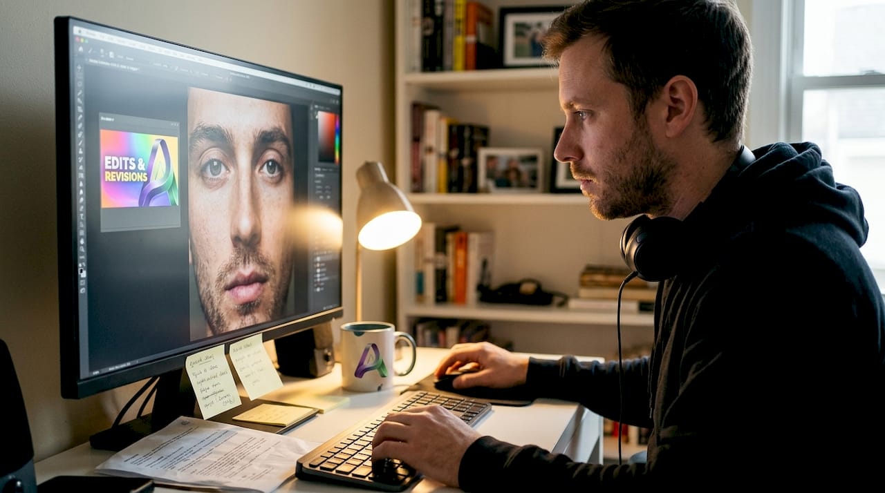
Bold text overlay styles communicate clear value propositions. These thumbnails feature large, readable text that promises specific benefits or reveals intriguing information. Text typically uses high-contrast colors and occupies 30-50% of the image. This approach works exceptionally well for educational content, tutorials, and list-based videos. The main advantage is immediate clarity about video content, but poorly executed text can appear cluttered or unprofessional.
Minimalistic styles highlight key elements without visual noise. These designs use clean backgrounds, limited color palettes, and focused composition to draw attention to one or two central elements. They perform well for tech reviews, design content, and premium brand positioning. While they project sophistication and clarity, minimalist thumbnails may lack the urgency that drives impulse clicks in competitive niches.
Cinematic styles add drama through lighting and composition. These thumbnails mimic movie poster aesthetics with dramatic lighting, depth of field effects, and carefully staged scenes. They excel for storytelling content, vlogs, and entertainment videos. The professional appearance elevates perceived content quality, though they require more production effort and may not suit quick-turnaround content.
Infographic styles deliver data-driven context at a glance. These thumbnails incorporate charts, statistics, or visual diagrams that preview the video's informational value. They work perfectly for analytical content, research summaries, and comparison videos. The immediate credibility boost appeals to information-seeking viewers, but complex graphics can become illegible at small sizes.
Comparing thumbnail styles: performance and best use cases
Each thumbnail style delivers different results depending on your specific context. Using the right thumbnail style for your niche can improve click-through rates by up to 30%. Understanding these performance differences helps you make strategic choices.
| Style | Engagement Level | AI Creation Ease | Best Content Fit | Mobile Performance |
|---|---|---|---|---|
| Close-up face | Very High | Easy | Personal vlogs, reactions, commentary | Excellent |
| Bold text overlay | High | Very Easy | Tutorials, lists, how-to guides | Good |
| Minimalistic | Medium-High | Medium | Tech reviews, design, premium content | Very Good |
| Cinematic | High | Difficult | Storytelling, entertainment, travel | Good |
| Infographic | Medium | Medium | Analysis, research, comparisons | Fair |
Your content category significantly influences style effectiveness. Gaming channels often succeed with vibrant, high-energy designs featuring exaggerated expressions and bold text. Educational channels typically perform better with clean text overlays that clearly state the learning outcome. Beauty and lifestyle content thrives on polished, aesthetically pleasing compositions that showcase results.
AI tools dramatically simplify style adaptation. Modern thumbnail generators analyze your video content, suggest appropriate styles, and automatically adjust elements for maximum impact. You can test multiple style variations in minutes rather than hours, then deploy the highest-performing option. This rapid iteration capability transforms thumbnail optimization from guesswork into data-driven decision making.
Pro Tip: Create a thumbnail template library with 3-4 proven styles for your channel. This approach maintains consistency while providing variety. Rotate styles based on content type rather than using the same design for every video, which prevents audience fatigue while preserving brand recognition.
Audience demographics also matter. Younger audiences typically respond better to bold, colorful designs with dramatic elements. Professional audiences prefer cleaner, more subdued aesthetics. Geographic and cultural factors influence color psychology and visual preferences. Testing reveals these patterns within your specific viewer base.
Making the right choice: how to select the best thumbnail style for your channel
Selecting your optimal thumbnail style requires systematic analysis and testing. Continuous testing and refinement of thumbnail styles drive sustained growth in views and engagement. Follow this strategic approach to identify and optimize your best-performing styles.
-
Analyze your existing top performers. Review your 10 highest-performing videos and identify common thumbnail elements. Look for patterns in color schemes, composition, text usage, and emotional tone. These patterns reveal what already resonates with your audience.
-
Define your content categories. Group your videos into 3-5 distinct types based on format and topic. Educational content, entertainment pieces, product reviews, and personal stories each benefit from different thumbnail approaches. Create style guidelines for each category.
-
Leverage AI customization tools. Use thumbnail generators that offer style templates aligned with your analysis. Customize these templates with your brand colors, fonts, and visual elements. AI tools can suggest optimal text placement, color contrasts, and composition based on proven engagement data.
-
Implement structured A/B testing. Create two thumbnail variations for new videos using different styles. YouTube allows thumbnail changes, so test alternatives and monitor performance over 48-72 hours. Track click-through rate, watch time, and audience retention to measure true effectiveness.
-
Establish brand consistency guidelines. Document your chosen color palette, typography standards, and compositional rules. This framework ensures recognizability while allowing creative variation. Your thumbnails should feel cohesively branded without becoming monotonous.
-
Monitor performance metrics regularly. Review thumbnail analytics monthly to identify trends and shifts in audience preferences. What worked six months ago may underperform today as viewer expectations evolve. Stay adaptable and willing to refine your approach.
"The most successful YouTube creators treat thumbnails as a science, not an art. They test relentlessly, measure precisely, and optimize continuously based on real data rather than assumptions."
Incorporate feedback loops into your process. Pay attention to comments mentioning thumbnails, both positive and negative. Survey your audience occasionally about visual preferences. This qualitative data complements your quantitative metrics and reveals insights that numbers alone might miss.
Enhance your thumbnails with AI-powered tools
Ready to transform your thumbnail creation process? Our platform offers comprehensive solutions for YouTube creators seeking to maximize engagement through optimized thumbnail designs. Discover free and paid AI thumbnail tools that streamline your workflow and eliminate the need for complex design software.
Access detailed YouTube thumbnail tips from industry experts who've helped thousands of creators boost their click-through rates. Our step-by-step guides walk you through the entire process, from concept to final export. Whether you're just starting or looking to refine an established channel, our AI-powered approach adapts to your specific needs. Learn how to create YouTube thumbnails that stand out in crowded feeds and convert viewers into loyal subscribers. The platform combines cutting-edge AI technology with proven design principles to deliver professional results in seconds.
FAQ
What are the most effective thumbnail styles for increasing YouTube views?
Close-up face shots with expressive emotions consistently deliver the highest click-through rates across most content categories. Bold text overlays that clearly communicate value also perform exceptionally well, particularly for educational and tutorial content. The most effective approach combines multiple elements, such as an expressive face with concise, benefit-driven text that tells viewers exactly what they'll gain from watching.
How can AI improve the thumbnail creation process?
AI automates time-consuming design tasks like background removal, color optimization, and text placement based on proven engagement patterns. It enables rapid testing of multiple style variations, allowing you to compare performance data and select the best option. AI thumbnail creation tools analyze your content and suggest design elements that align with high-performing thumbnails in your niche. This technology transforms thumbnail creation from a manual, hours-long process into a streamlined workflow that takes minutes.
Which thumbnail style works best for niche channels?
Niche channels benefit most from styles that match their audience's specific expectations and viewing context. A financial advice channel succeeds with clean, professional designs featuring data visualizations, while a gaming channel thrives on energetic, colorful compositions with dramatic expressions. The key is maintaining consistent branding elements across all thumbnails so your target audience instantly recognizes your content. Test different styles within your niche and let performance data guide your final choice rather than following generic best practices.
How often should I update my thumbnail style?
Maintain your core style for at least 3-6 months to establish brand recognition, but continuously optimize within that framework. Small refinements like adjusting text size, tweaking color saturation, or modifying composition can improve performance without confusing your audience. Major style overhauls should only happen when data clearly shows declining performance or when your content direction shifts significantly. Consistency builds trust and recognition, while thoughtful evolution keeps your channel feeling fresh and relevant to changing viewer preferences.